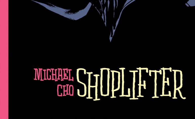
Shoplifter – Two Tone Graphic Novel by Michael Cho
This week is the official release of Michael Cho’s Shoplifter from Pantheon Books (an imprint of Random House LLC). Last week The Beguiling held a launch at local Toronto bar The Central and at it, Cho spoke about this work, his body of work, and why he chose the colour pink.
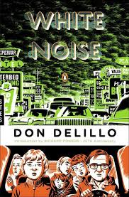
Cho a is Toronto artist and illustrator whose work is familiar on variant covers and Penguin Books – including the jacket art for 25th Anniversary Edition of Don Delillo’s White Noise.
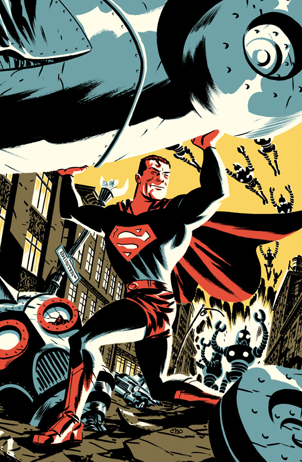
Golden Age Superman (with robots) Variant Cover by Michael Cho
Shoplifter is about Corinna Park, who, five years after completing her degree in English Literature, is still working at an advertising agency and NOT writing the novels she’d thought she would be. It’s the journey of all those “who know how to critique versus create”. The first scene is her in a brainstorming meeting for “fly body scent” to be marketed to twelve year old girls. Her contribution stops the team in its tracks.
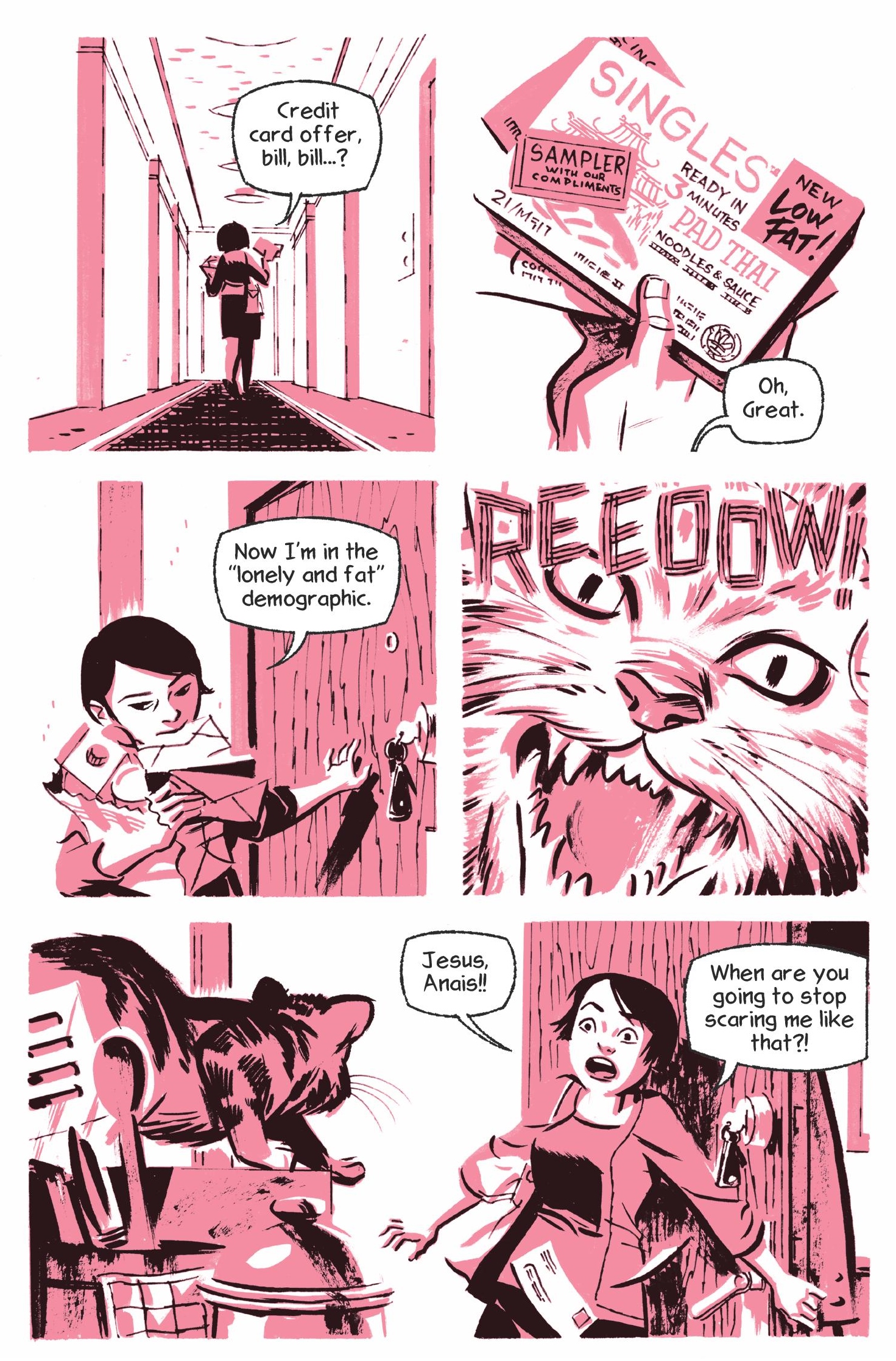
Single in the City – microwave food and a cat.
When asked about how his style has changed, Cho said, “I hope so, that it’s evolved. In this work I’ve explored lines much more. As artists we have to go back and evaluate the things that we’ve previously rejected. In art school I didn’t see the value in the Old Masters – or rather I didn’t see their relevance for today’s audiences. But then in my thirties I went to Italy and I saw Michelangelo’s pen and ink work and was blown away.”
“So he just needed a good colourist?” quipped the host to much laughter. “What do you like about side projects?”
“You have complete control and therefore can show the reader that every expression, every hair on their head is purposeful.”
“So you don’t like joint projects?”
“It’s a different thing,” Cho replied. “There’s a push-pull but working with someone can show you things you hadn’t thought of, can surprise you and lead to a stronger work.”
“But sometimes,” he continued, “you just want to have control.”
“Digital or Paper?” was another question.
“This one I felt strong had to be pen on paper, except for the lettering – I’m not a masochist!” That prompted a burst of laughter from the audience.
“I’d do thumbnails on comic sized paper, with all the dialogue, then move to pencils. Using a lightbox I’d do the tones (so that there were no pencil marks) and then ink right on them.” The artists in the room gasped at that admission. “I’d have to be careful, especially with the small details because if I’d ruined it I’d have to start over.”
“And did that happen?”
“There were about five sheets I had to redo. That is one thing I missed about digital, the zoom factor so the fine detail is easier to see, well that and undo button.” More laughter.
“I’m not against or for paper versus digital, each are a tool in my tool box with different strengths and weaknesses.”
“There are a lot of street scenes, are they specific?”
Confirming that the city itself was unnamed, Cho wanted the readers to feel that they were real streets and not generic. So, drawing on his previous work, Back Alleys and Urban Landscapes, he mixed real buildings from different parts of Toronto together, forming a familiar but unknown streetscape.
And the question that will probably top his most asked question – why pink?
“No one else had one! I knew I wanted to do a two tone work, and it’s common for that style to be in teal or blue. So I said, why not?”
Why not indeed. You can find this literary graphic novel at comic book stores or right here on Amazon.com.


